Research & Discovery:
To rapidly build domain expertise, I immersed myself in both the legacy ATS and Bullhorn through hands-on working sessions with recruiters and SMEs. These sessions exposed real workflows, edge cases, and workarounds used in day-to-day recruiting and billing.
- Shadowing recruiters across core recruiting and billing tasks
- Identifying workflow inefficiencies and data gaps
- Exploring Bullhorn capabilities and constraints with SMEs and IT
- Gathering direct feedback on recruiter goals, frustrations, and expectations
This approach allowed me to ask informed questions early, uncover unmet needs, and establish strong cross-functional trust.This process allowed me to ask informed questions early, uncover unmet needs, and establish strong cross-functional relationships.
Recruiters don’t struggle with volume—they struggle with momentum.
Defining the Problem Space:
Using insights from discovery, I mapped end-to-end recruiter journeys and audited system workflows to:
- Identify gaps between the legacy ATS and Bullhorn
- Clarify where custom UX solutions were required
- Align stakeholders on MVP priorities and rollout sequencing
These artifacts created a shared understanding of what needed to be solved first—and why.These artifacts helped create a shared understanding of what needed to be solved first—and why.
User Stories & Requirements Alignment:
I partnered closely with Business Analysts to define clear, actionable user stories for each identified gap. Beyond contributing directly, I helped establish a repeatable, user-centered approach by:
- Guiding BAs on how to elicit requirements from SMEs
- Encouraging problem-first conversations before solutioning
- Ensuring each story clearly articulated the who, what, and why
This improved consistency, reduced ambiguity, and supported scalable decision-making.
Design System Recreation & Extension:
Early in the project, I recreated Bullhorn’s design system in Adobe XD using fully interactive components.
This enabled:
- Rapid, consistent design across multiple initiatives
- Centralized component updates that propagated across designs
- Seamless extension of the system as new gaps emerged
I introduced custom components—including modals, alerts, icons, and empty states—while maintaining strict visual and interaction parity with Bullhorn.
Flow & Data Exploration:
I mapped recruiter workflows and underlying data flows to:
- Compare legacy ATS processes with Bullhorn workflows
- Identify simplification opportunities
- Clarify how data would be stored, passed, and retrieved
These flows supported both UX decisions and technical alignment with IT and vendors.
Mid-Fidelity Wireframes:
Mid-fidelity wireframes intentionally removed branding and color to focus feedback on usability and interaction. This phase validated:
- Field types and behaviors
- Information hierarchy and layout
- Tabbing order and form logic
This ensured alignment before moving into high-fidelity design.
Stakeholder Collaboration & Validation:
I led frequent design walkthroughs using interactive prototypes, guiding stakeholders through real recruiter scenarios. Instead of reviewing static screens, I:
- Demonstrated end-to-end workflows
- Narrated recruiter decision-making
- Validated UX decisions in real time
This approach accelerated feedback cycles and improved stakeholder confidence.
Every delay in the system feels like a lost candidate.
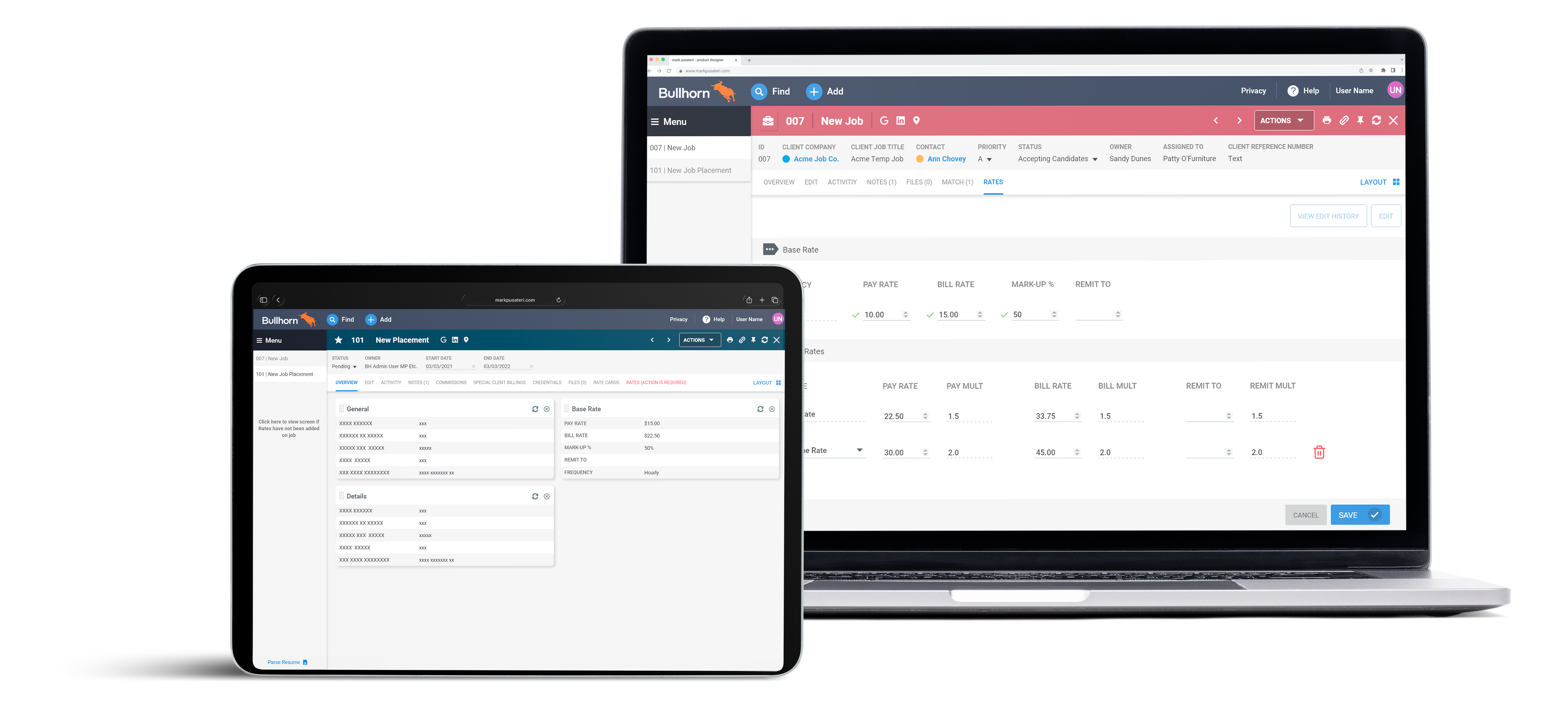
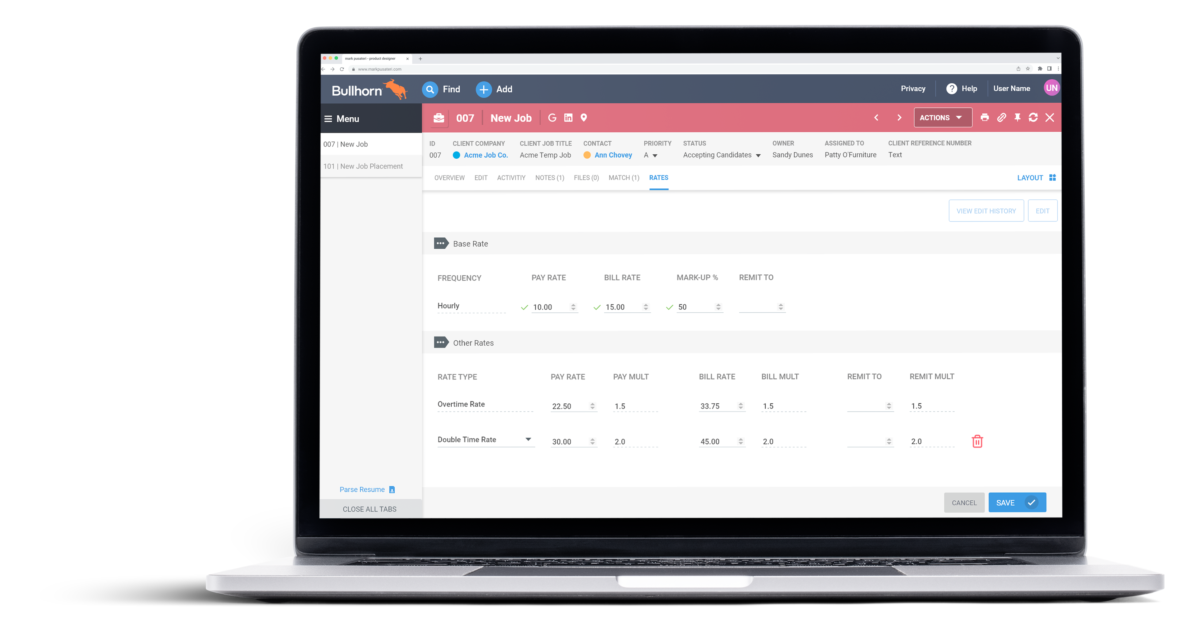
High-Fidelity Design & Consistency:
Recruiters cited inconsistent layouts and UI patterns as a major pain point in the legacy system. To address this, I ensured:
- Visual and interaction parity between Bullhorn-native and custom gap screens
- Consistent patterns for tables, forms, alerts, empty states, buttons, icons, and animations
I worked closely with an offshore development partner, providing explicit design guidance to ensure seamless implementation.
Interactive Prototypes:
High-fidelity interactive prototypes were used continuously to review designs with recruiters and stakeholders. Feedback was incorporated iteratively, allowing solutions to be validated before development and reducing rework downstream.
Outcome:
The project enabled a smooth Bullhorn rollout by closing critical workflow gaps, reducing recruiter friction, and establishing a scalable UX foundation that continues to support ongoing ATS enhancements. The success of the rollout and the strength of cross-functional collaboration led the Product Manager to request an extension of my contract to support additional ATS initiatives and follow-on projects.