Research:
What do the IT leaders, stakeholders and sponsors need to help them work smarter and quicker? In order to get a greater insight into these users, three sessions were held in order to get a better idea what their goals are for this tool, their needs, pain points and wish-list items. The data collected validated our initial assumption that users desperately needed a way to view ALL deployments going out on a global scale. This tool would allow them to make better, more informed decisions based on the current landscape of past, current and future project and product releases.
Explore the visualization (Lo-Fi/Med-Fi)
Once we agreed on our initial ideas and explored our data points, gathered from the roundtable discussions, I began sketching for the vision. I began with quick sketches. This allowed me to quickly make adjustments on the fly while jotting down notes along the way. Then I took a handful that made the cut and worked them out in Illustrator. I did this in monotone so leadership wouldn't get distracted. This way we can concentrate on layout and functionality. We quickly chose a few basic components/screens and the layout of our visualizations. With the group, I explored user interaction around the radar and snapshot screens to determine how to best display deployments allowing users the ability to easily get detailed information on each item.
Solution:
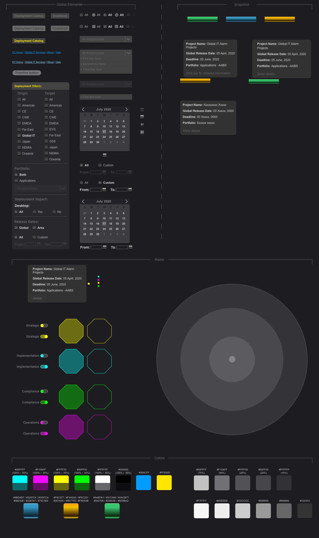
An interactive radar | a dynamic bar chart
After we explored my various visualization ideas, we decided to deliver an interactive tool that would allow users to scroll through all entries, review deployments and the duration of each release and get a birds-eye view by exploring an innovative radar. Users will be able to explore, sort and filter the data and see a chart that displays deployments.
Usability Testing - Less is more:
With a more cohesive visualization and interaction set, I created an initial prototype in Adobe Flex of the three screens and conducted a usability study to validate our initial findings to gather additional feedback from our users. For this study, I used a working prototype of for users to navigate based on simple queries to follow. At the start of each session, we asked two introductory questions about the visualization, followed by asking them to complete three tasks, which entailed interacting with the radar, bar chart and filtering the data. After completing all three tasks, we asked the participants follow-up questions regarding their overall impressions.
Findings:
The study showed that the participants had an overall positive first impression of the tool. The radar view was the success I was hoping for. It not only had the wow factor, but also displayed the data how they were hoping. My primary takeaway from this experience was the need for simplification and basic layout enhancements. Our original goal was to provide an in-depth experience whereby users could examine data in a specific timeframe and view detailed information along the way.
Takeaways
- As a result of the study, I limited the detailed information to a popup, rather than within its own pane on the screen. This opened up the layout, allowing users to view larger chucks without the need for scrolling or panning.
- Too many filter options. The majority of the users felt there were too many filter selections to scroll through. We reduced the number, resulting in a filter pane that no longer scrolled.
- Lastly, a few of the “key stakeholders” decided it was important to have a screen dedicated to the Change History of each item. It was important to know the when’s and where’s of deployments, but also tracking changes based on “collision” dates, while making accountability a new key goal.
Design choices:
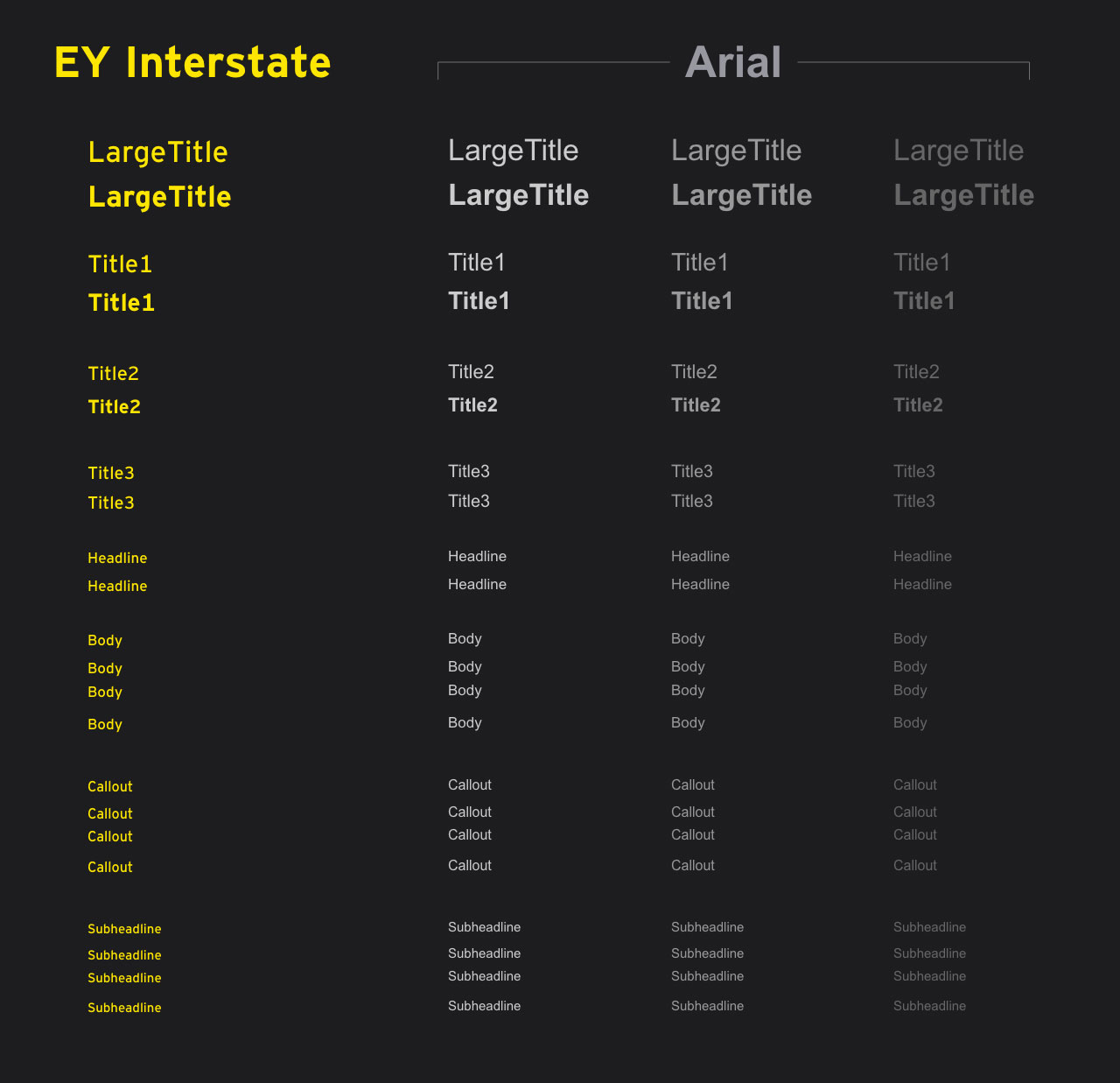
As with all companies, EY has strict brand guidelines we must adhere to (colors, fonts, voice, etc.). It's limited in scope so I had to deviate a touch to introduce some nice colors for the screens that are more visual in nature. I chose to use a few highlight colors with a 35% transparent sibling. In essence it doubled the colors and worked out very well on the nice dark-out background.
Here you can see a fraction of the design system put into place:
Success!:
Due to the user base consisting only of Global IT leadership and comms leads, I chose to determine success based on user feedback. I reached out to an internal team that specialized in feedback requests within the firm. We organized the form based on usability, sustainability and effectiveness. Although the feedback showed it was an overwhelming success, I was also able to gather specific feedback to help enhance the tool for future versions.
Lastly, the “proud” moment came when multiple requests came from around the firm, seeking me out, to repurpose the tool for their own team’s needs. It was repurposed for three separate teams around North America and the UK.


